Component Library Guidelines
A single source of truth for designing and building secure, scalable payment flows.
Main Role: Lead UX Designer
Overview:
To support the global rollout of Click to Pay (CTP) and Visa Payment Passkey (VPP), I created a centralised UX component library and interactive guidelines.
The goal was to provide internal teams and external partners with a clear, consistent way to design and implement payment flows - reducing confusion, improving adoption, and ensuring trustworthy user experiences across all markets.
The Context:
As Click to Pay expanded globally, design documentation became fragmented. Stakeholders relied on outdated files and scattered resources, which forced the design team to spend significant time on manual support.
Without a shared reference point, implementations became inconsistent, and teams were repeatedly "reinventing the wheel" for standard flows.
The Challenge: Zero Tolerance for Failure
No Single Source of Truth: Documentation lived across multiple locations, creating inconsistencies in global payment experiences.
Misunderstood Components: Complex authentication flows, such as Visa Payment Passkey, were often misapplied or underutilised.
Developer Dependency: A lack of accessible documentation forced engineering teams to rely heavily on designers for basic clarification and QA.
Scaling these products introduced three main friction points:
I designed and delivered a centralised component library and UX guideline system that aligned designers, developers, and global partners. My work included:
My Role
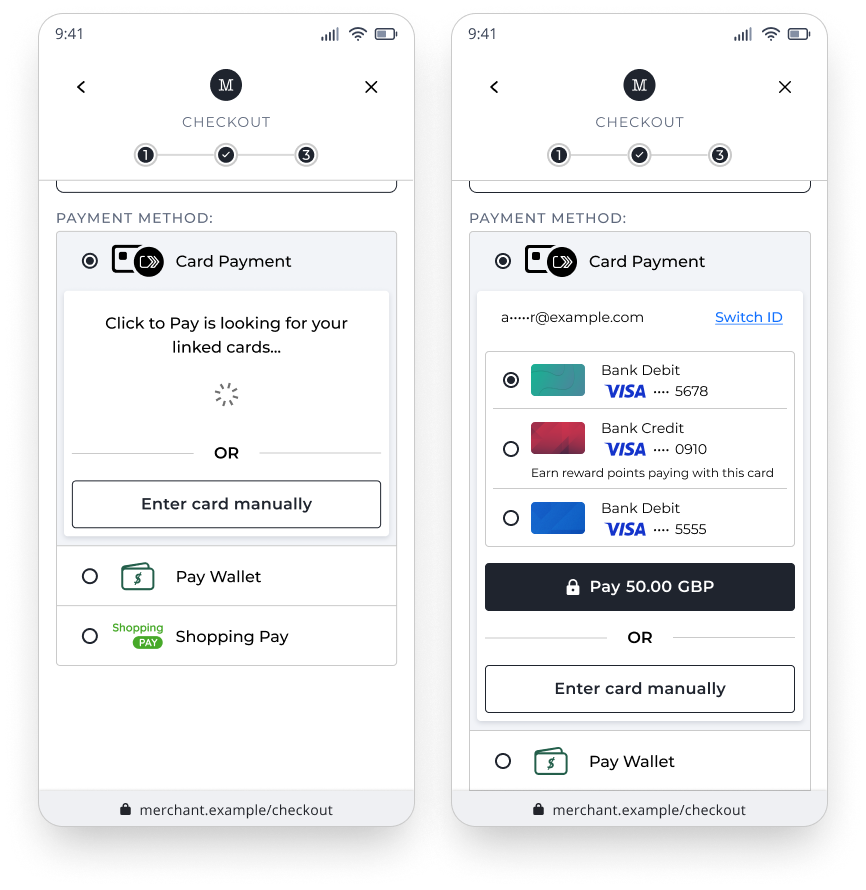
Modular "Super Components"
Designing elements that adapt across multiple payment flows and regional requirements.
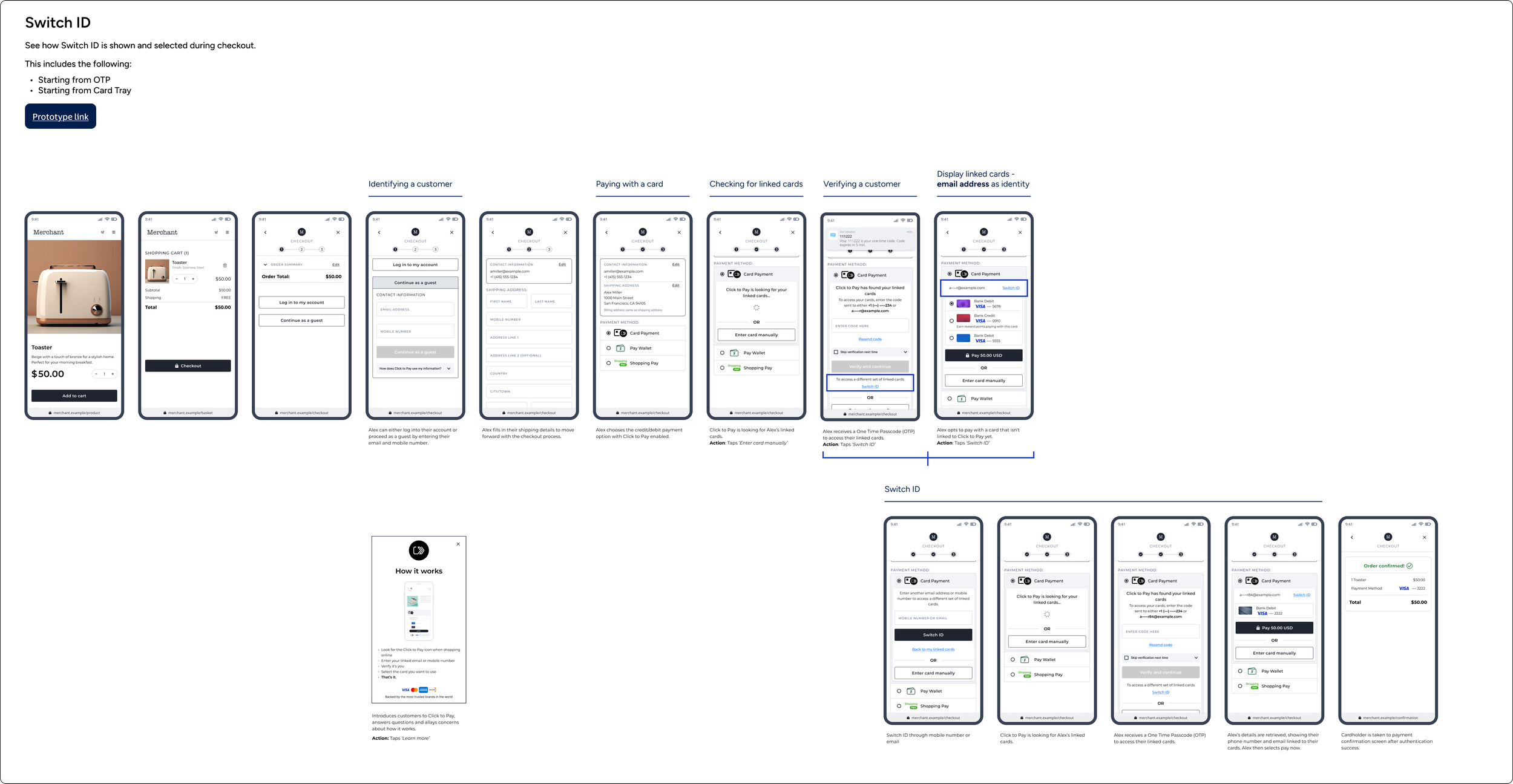
Annotated User Flows
Creating clear visual logic to explain how and why components should be used.
Self-Serve Documentation
Structuring the system so partners could implement flows without needing direct design oversight.
The Deliverable: CTP Design Package
I architected a comprehensive CTP Design Package—the master file containing all UX flows shared with global and regional stakeholders.
This included:
Core Product Flows: The foundational "Happy Path" and checkout journeys.
CTP Consumer Portal: End-to-end designs for the user management portal.
Supported Authentication: Detailed logic for VPP and secure guest flows.
Interactive Demos: High-fidelity prototypes used to align technical teams and stakeholders.
Impact & Business Outcome
I designed and delivered a centralised component library and UX guideline system that aligned designers, developers, and global partners. My work included:
Global Standard
This is now the only guide for how to use CTP patterns and components globally.
Institutional Alignment
I presented the guidelines at a Global Design All Hands to an audience of 250+ designers and stakeholders, driving immediate adoption.
Efficiency
Significantly reduced duplication of work across teams and lowered the dependency on designers for implementation support.
Key Takeaways & Leadership
Driving Global Alignment: Beyond just design, this project was an exercise in stakeholder management, requiring me to align 250+ global designers and stakeholders under a single vision.
Scalability as a Priority: By creating "super components" and modular documentation, I ensured the system was flexible, not fragile, allowing it to support future product expansions without a total overhaul.
Operational Excellence: I reduced "design debt" by empowering developers and partners to self-serve, effectively freeing up the design team to focus on high-level strategy rather than repetitive QA.
Defining the Standard: Successfully establishing the only definitive guide for CTP patterns at Visa demonstrates my ability to own a product's UX integrity on a global scale.